Next.js 15에서 storybook 세팅 및 tailwind 연동 방법 (pnpm)
2025-02-02
Next.jsStorybookTailwind
Table of Contents
설치
- Package Manager: pnpm 9.15.4
- node.js: v20.18.0
pnpm create next-app
✔ What is your project named? … my-app
✔ Would you like to use TypeScript? … No / ✔Yes
✔ Would you like to use ESLint? … No / ✔Yes
✔ Would you like to use Tailwind CSS? … No / ✔Yes
✔ Would you like your code inside a `src/` directory? … ✔No / Yes
✔ Would you like to use App Router? (recommended) … No / ✔Yes
✔ Would you like to use Turbopack for `next dev`? … ✔No / Yes
✔ Would you like to customize the import alias (`@/*` by default)? … ✔No / Yes
- 기호에 맞게 옵션을 찍어줍니다.
pnpm dlx storybook@latest init
pnpm dlx는 원격 패키지를 임시로 설치하고 실행하는 명령어입니다. 이를 사용하여 Storybook을 초기화할 수 있습니다.
설치가 완료 되고, localhost:6006으로 접속하시면
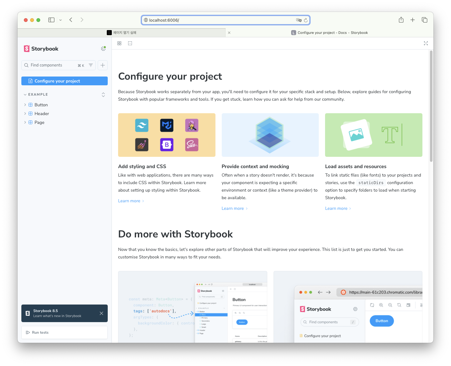
페이지가 펼쳐지면 성공입니다.
파일 구조 및 역할
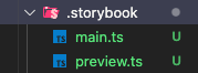
.storybook/main.ts
import type { StorybookConfig } from "@storybook/nextjs";

const config: StorybookConfig = {
	// 스토리 파일 경로 지정
	stories: [
		"../stories/**/*.mdx",
		"../stories/**/*.stories.@(js|jsx|mjs|ts|tsx)",
	],
	// Storybook 기능 확장
	addons: [
		"@storybook/addon-onboarding",
		"@storybook/addon-essentials",
		"@chromatic-com/storybook",
		"@storybook/addon-interactions",
	],
	//  Next.js 전용 Storybook 사용
	framework: {
		name: "@storybook/nextjs",
		options: {},
	},
	// 정적 파일 지원
	staticDirs: ["../public"],
};

export default config;
stories: 스토리 파일 경로 지정addons: Storybook 기능 확장framework: Next.js 전용 Storybook 사용staticDirs: 정적 파일 지원- Next.js 프로젝트에서 Storybook을 설정하는 기본적인 구성.
.storybook/preview.ts
import type { Preview } from "@storybook/react";

const preview: Preview = {
	// Storybook의 기본 동작을 조정하는 속성.
	parameters: {
		// Controls 패널에서 자동으로 속성을 감지하는 기능을 설정.
		controls: {
			//- `background`, `color` 속성 → 색상 선택기로 자동 매핑.
			//- `Date`로 끝나는 속성 → 날짜 선택기로 자동 매핑.
			matchers: {
				color: /(background|color)$/i,
				date: /Date$/i,
			},
		},
	},
};
export default preview;
background,color속성 → 색상 선택기로 자동 매핑.Date로 끝나는 속성 → 날짜 선택기로 자동 매핑.- Storybook에서 Controls 패널을 최적화.
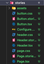
stories 폴더 안에는 많은 예제들이 다운받아져 있습니다. 패턴이 보이시나요? tsx파일과 stories.ts 파일, css 파일로 구성되어 있습니다.
Button.tsx
import React from 'react';

import './button.css';

export interface ButtonProps {
/** Is this the principal call to action on the page? */
	primary?: boolean;
/** What background color to use */
	backgroundColor?: string;
/** How large should the button be? */
	size?: 'small' | 'medium' | 'large';
/** Button contents */
	label: string;
/** Optional click handler */
	onClick?: () => void;
}

/** Primary UI component for user interaction */
export const Button = ({
	primary = false,
	size = 'medium',
	backgroundColor,
	label,
	...props
}: ButtonProps) => {
	const mode = primary ? 'storybook-button--primary' : 'storybook-button--secondary';
	return (
		<button
		type="button"
		className={['storybook-button', `storybook-button--${size}`, mode].join(' ')}
	{...props}>
		{label}
	<style jsx>{`
		button {
		background-color: ${backgroundColor};
		}
	`}</style>
	</button>
	);
};
- 일반적인 Button 컴포넌트입니다.
Button.stories.ts
import type { Meta, StoryObj } from '@storybook/react';

import { fn } from '@storybook/test';

import { Button } from './Button';


// More on how to set up stories at: https://storybook.js.org/docs/writing-stories#default-export
const meta = {
	title: 'Example/Button',
	component: Button,
	parameters: {
	// Optional parameter to center the component in the Canvas. More info: https://storybook.js.org/docs/configure/story-layout
		layout: 'centered',
	},
// This component will have an automatically generated Autodocs entry: https://storybook.js.org/docs/writing-docs/autodocs
	tags: ['autodocs'],
// More on argTypes: https://storybook.js.org/docs/api/argtypes
	argTypes: {
		backgroundColor: { control: 'color' },
	},
// Use `fn` to spy on the onClick arg, which will appear in the actions panel once invoked: https://storybook.js.org/docs/essentials/actions#action-args
	args: { onClick: fn() },
} satisfies Meta<typeof Button>;

export default meta;

type Story = StoryObj<typeof meta>;

// More on writing stories with args: https://storybook.js.org/docs/writing-stories/args
export const Primary: Story = {
	args: {
		primary: true,
		label: 'Button',
	},
};

export const Secondary: Story = {
	args: {
		label: 'Button',
	},
};

export const Large: Story = {
	args: {
		size: 'large',
		label: 'Button',
	},
};

export const Small: Story = {
	args: {
		size: 'small',
		label: 'Button',
	},
};
- 스토리 파일입니다. 구성을 살펴보겠습니다.
const meta = {
	//Storybook에서 분류.
	title: 'Example/Button',
	// 컴포넌트를 설정
	component: Button,
	// 컴포넌트를 화면 중앙에 배치.
	parameters: {
		layout: 'centered',
	},
	// 자동 문서화 활성화
	tags: ['autodocs'],
	// 색상 선택기로 변경 가능
	argTypes: {
		backgroundColor: { control: 'color' },
	},
	// Actions 패널에서 클릭 이벤트 확인 가능.
	args: { onClick: fn() },
} satisfies Meta<typeof Button>;

export default meta;
title→"Example/Button"으로 Storybook에서 분류.component→Button컴포넌트를 설정.parameters.layout = 'centered'→ 컴포넌트를 화면 중앙에 배치.tags = ['autodocs']→ 자동 문서화 활성화.argTypes.backgroundColor→ 색상 선택기로 변경 가능.args.onClick = fn()→ Actions 패널에서 클릭 이벤트 확인 가능.satisfies Meta<typeof Button>→ 타입 안전성 확보.
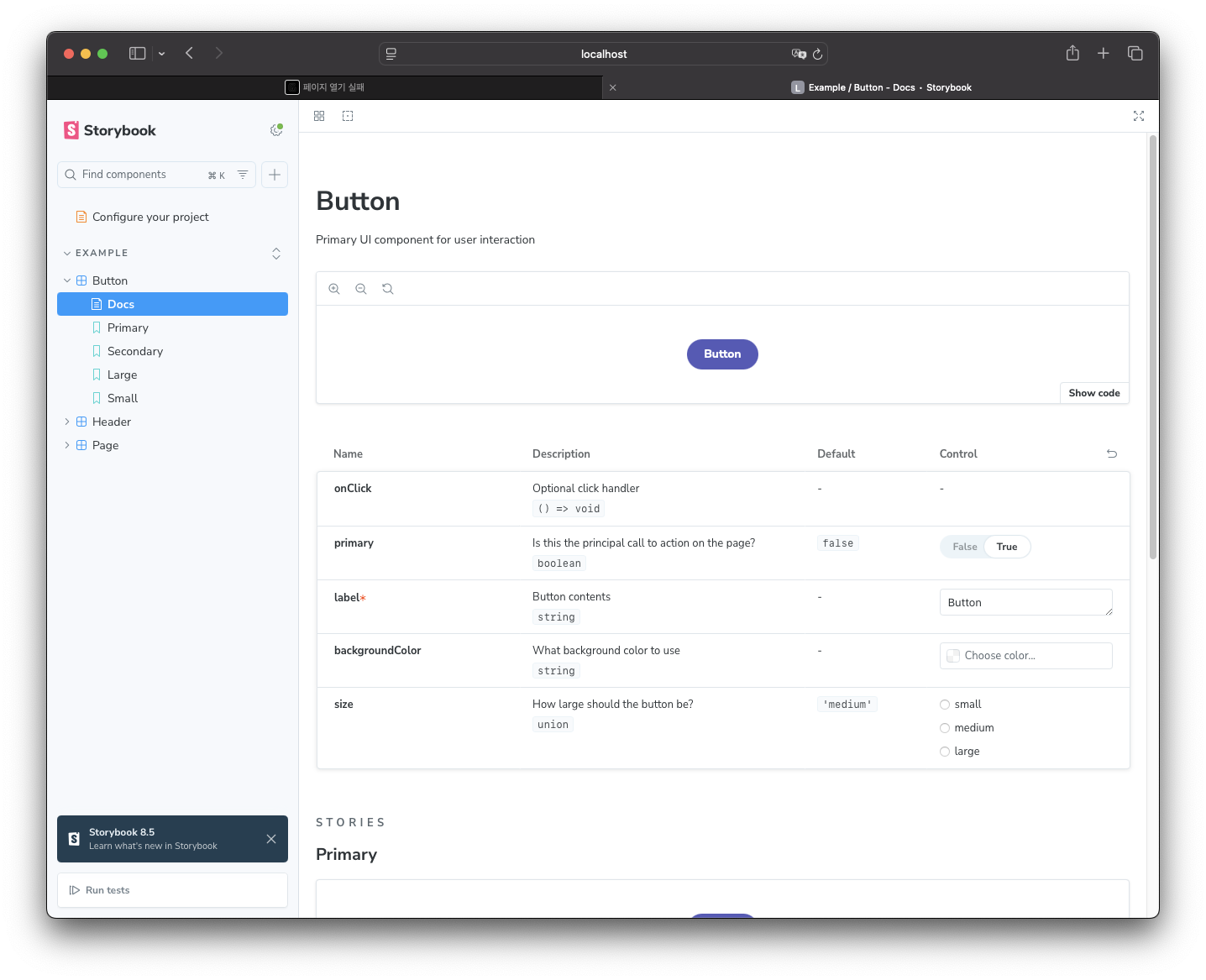
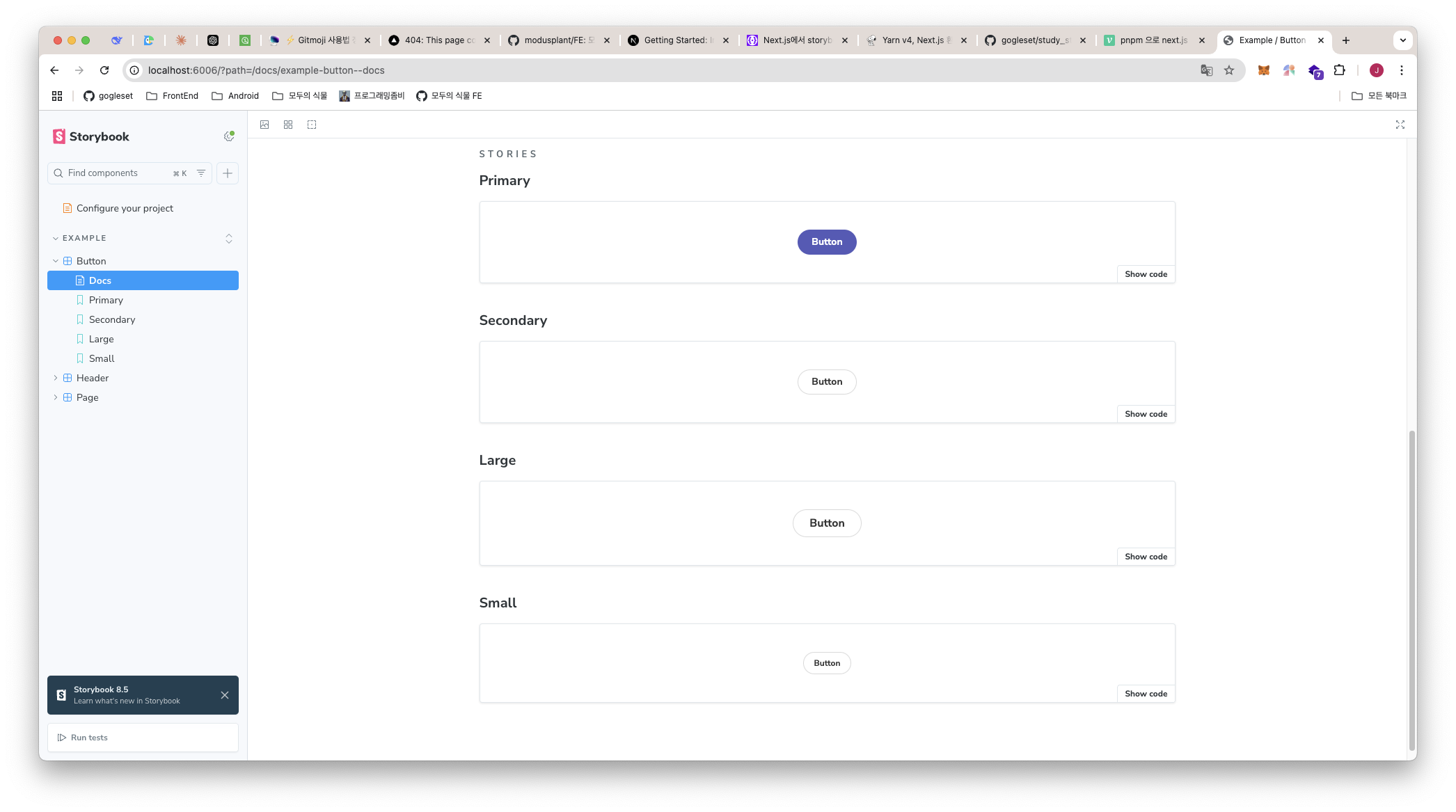
- 만들어졌습니다. Example 안에 Button 컴포넌트가 보이고,
tags = ['autodocs']로 자동 문서화가 된 모습과parameters.layout = 'centered'로 화면 중앙에 컴포넌트가 배치 된 모습입니다.
type Story = StoryObj<typeof meta>;

export const Primary: Story = {
	args: {
		primary: true,
		label: 'Button',
	},
};

export const Secondary: Story = {
	args: {
		label: 'Button',
	},
};

export const Large: Story = {
	args: {
		size: 'large',
	label: 'Button',
	},
};

export const Small: Story = {
	args: {
		size: 'small',
		label: 'Button',
	},
};
- 상태값을 미리 설정하여 볼 수 있습니다.
- 이렇게 다른 기본값으로 설정한 컴포넌트를 볼 수 있습니다.
Tailwind CSS 적용
globals.css
@tailwind base;
@tailwind components;
@tailwind utilities;

:root {
  --background: #ffffff;
  --foreground: #171717;
}

@media (prefers-color-scheme: dark) {
  :root {
    --background: #0a0a0a;
    --foreground: #ededed;
  }
}

body {
  color: var(--foreground);
  background: var(--background);
  font-family: Arial, Helvetica, sans-serif;
}
.storybook/preview.ts
import type { Preview } from "@storybook/react";

// tailwind css 적용
import "../app/globals.css";

const preview: Preview = {
	// Storybook의 기본 동작을 조정하는 속성.
	parameters: {
		// Controls 패널에서 자동으로 속성을 감지하는 기능을 설정.
		controls: {
			//- `background`, `color` 속성 → 색상 선택기로 자동 매핑.
			//- `Date`로 끝나는 속성 → 날짜 선택기로 자동 매핑.
			matchers: {
				color: /(background|color)$/i,
				date: /Date$/i,
			},
		},
	},
};
export default preview;
- preview.ts 파일에 tailwindcss를 적용한 globals.css파일을 import 해줍니다.